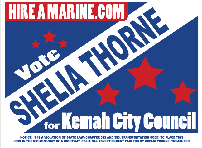
Pick a sign- What has better eye appeal
Any suggested minor tweaks on the the sign you choose are welcomed.
For example on Number 2 I think my name should be a bit larger and/ or the letters Hireamarine.com should just be red letters on the blue background and not contained in a red box. Leave it alone is a comment as well. Let me know…
#1

#2