Fonts, Colors, and the Hidden Power of Consistency
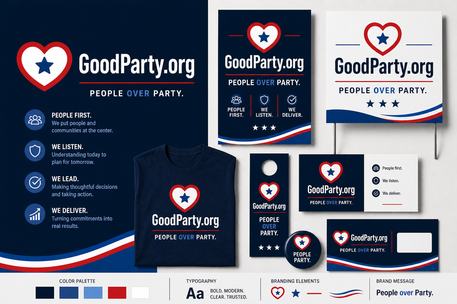
Most people think campaigns are won on policy. But before voters ever read a platform, they see you.
Consistent design isn’t just aesthetic. It builds trust.
When your fonts, colors, and visuals stay the same across everything:
- Your campaign looks more credible
- Voters recognize you instantly
- Your message feels more organized and serious
Inconsistent design does the opposite. It creates friction. It makes people subconsciously question whether you’re ready to lead.
Take a look at your own logo.
Are those same colors and fonts showing up everywhere your campaign lives?
Winning campaigns treat design like a system, not an afterthought.
Same colors. Same fonts. Same visual language everywhere.
Because familiarity builds confidence. And confidence wins votes.
Be honest, would someone recognize your campaign instantly from your design alone?
⬇️ Drop a quick self-rating. From 1 to 10, how consistent is your campaign branding and why?